UW EXP Study
Researching UW students’ long-term health and wellness using phone, survey, and Fitbit data.
Project Duration: 12 weeks
My Role: Content Writer, UI Designer
Overarching Project
Problem: The UW EXP study had no branding or public presence even though it is a large, established research project.
Solution: Design logos, a pamphlet, and a website for this study to educate a broader audience about its methodology and findings
Teamwork: I was the lead designer and writer on this project, but worked with the Principle Investigator and the Research Assistants that worked on the UW EXP study to ensure the designs were consistent with the study’s mission and vision.
Designing Icons
Design Requirements:
Each icon represented one aspect of the study (surveys, phone data)
Continuity among icons
A logo with the color scheme of the University of Washington
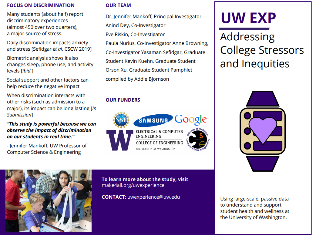
Creating a Pamphlet
Problem: The UW EXP study’s findings needed to be shared with university administrators, conference attendees, and financial stakeholders.
Solution: Design and share a professional pamphlet for the study to share with a wide audience.
Key Specifications:
Highlight differences in college experiences between different student demographics of students
Explain the study, ground it with quotes and preliminary findings, and honor team members and funders.
Encourage discussion about and future investment in the UW EXP study.
Writing a Website
Problem: UW EXP needed a public-facing online platform to generate visibility, share research papers, and recognize funders.
Solution: Create cohesive and informative website pages on the umbrella Make4All website.
My Work:
Wrote over 1500 words (4 pages) about UW EXP’s research questions, measurement tools, and findings, and linked published papers about the study’s findings.
Worked with mentors, including the principal investigator, to portray the study as a vibrant, robust biometric research project.
Integrated logo and icons to engage the user and illustrate the biometric research tools.
Reflection
Creating a brand for the UW EXP study was my first major design project. I was fortunate to be mentored by incredible graduate students and professors who gave feedback and advice to ensure the logos and content was meaningful and professional. I am especially proud of the pamphlet because it connects all the pieces of the study together, discusses findings about student wellness, and conforms to the University of Washington branding guide.
Areas of Improvement:
Using Adobe Illustrator instead Microsoft Publisher. I created all the logos in Microsoft Publisher because it was the tool I was most comfortable with. However, this confined me to simple shapes, imperfect detail work, and low definition options. Since then, I have learned to use Adobe Illustrator for all my visual design projects and will use this in the future.
Maintaining a consistent color palette. I did not maintain a singular color palette throughout the work because I initially did not understand the scope of my work until I had already made the initial logo. In retrospect, I should have used only one color palette, most likely the purple and gold color palette of the University of Washington.
Overall, I am proud of my work as a first-year designer, and know that I have gained expertise since then that I can apply to future projects.


